
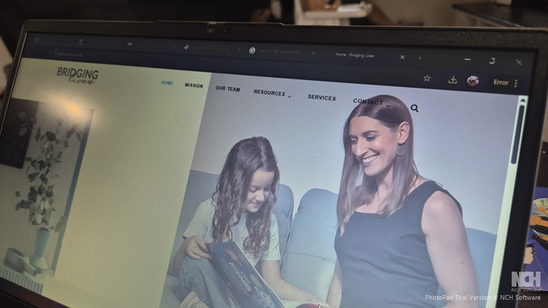
When it comes to building a website, the user experience is key. No matter how visually appealing your website is or how great your content may be, if your visitors can’t find what they need, it doesn’t matter. The menu design is one of the most essential elements of a positive user experience. The navigation menu is the backbone of your website’s structure, and how intuitive it is can make or break the overall experience.
First Impressions Matter
When someone lands on your website, they should know where and what to do. An intuitive menu helps guide them seamlessly through your site. It’s like having a trusted guide who shows them around, ensuring they don’t get lost or frustrated. When visitors are unsure where to click next, they will likely bounce off your site and head somewhere else. A well-structured, intuitive menu creates a positive first impression and invites users to explore more rather than frustrating them and causing them to leave.
User Experience and Engagement
Website navigation directly impacts how users interact with your site. If they can find what they’re looking for quickly and easily, they’re more likely to stay, explore more pages, and even convert. A poor menu design, on the other hand, can make users feel lost and disoriented. When your menu is intuitive, visitors feel in control of their browsing experience, which is crucial for keeping them engaged. If they can’t find their way around or feel confused, they’ll likely give up and leave. A simple, clear, and well-organized menu is key to improving user engagement and retaining visitors.
Mobile Responsiveness
With the rise of mobile browsing, your menu design must adapt across different platforms. Mobile-friendly websites are no longer a luxury they’re they’re a necessity. An intuitive menu should work seamlessly across mobile devices, desktops, and tablets. When users can easily navigate on their phones, they’re more likely to spend time on your site, whether browsing content or making a purchase. A menu that’s easy to access and use on mobile is a game-changer in today’s mobile-first world, and it directly impacts how well your site performs.
Simplifying Complex Information
For websites that feature a lot of content, organizing it in a logical, user-friendly way becomes even more important. This is where an intuitive menu design shines. It allows you to break down complex information and present it in an easily digestible format. By categorizing content and using clear labels, visitors won’t waste time hunting for the necessary information. A good menu structure guides users to their destination with just a few clicks. It reduces frustration and enhances the overall user experience.
Improved SEO
Believe it or not, your website’s navigation can affect your SEO. A well-structured menu helps search engines crawl and index your pages more efficiently. The more organized your content is, the easier for search engines like Google to understand your site. This can contribute to better rankings, which leads to more organic traffic. An intuitive menu doesn’t just enhance the user experience. It can also improve your website’s visibility in search engine results.
How to Make Your Menu Intuitive
Follow a few key principles to ensure your website’s menu is as intuitive as possible. First, keep it simple don’t overcrowd the menu with too many options. Prioritize the most important pages and organize them logically. Second, use clear, descriptive labels that make it obvious to users what they’ll find when they click. Avoid jargon or cryptic titles that might confuse visitors.
If you have many pages on your site, group related items together. For example, all blog posts can be under a “Blog” or “Resources” category, while services or products can have their own section. This makes navigation easier and more efficient. Additionally, make sure your menu is responsive, especially for mobile users. Whether you choose a hamburger menu or a dropdown menu, it should be easy to access and navigate on any device.
Lastly, consistency is key. Your menu design should remain the same across all pages of your site. This helps users become familiar with how to navigate, no matter where they are on your site. Consistency in design builds trust and improves the overall user experience.
In conclusion, an intuitive menu is one of the most vital elements when designing a website. It’s not just about aesthetics it’s about creating a seamless, user-friendly experience that keeps visitors engaged, helps them find what they’re looking for, and leads to higher conversion rates. A great menu helps users find their way with minimal effort, and that’s exactly what you want for your website.